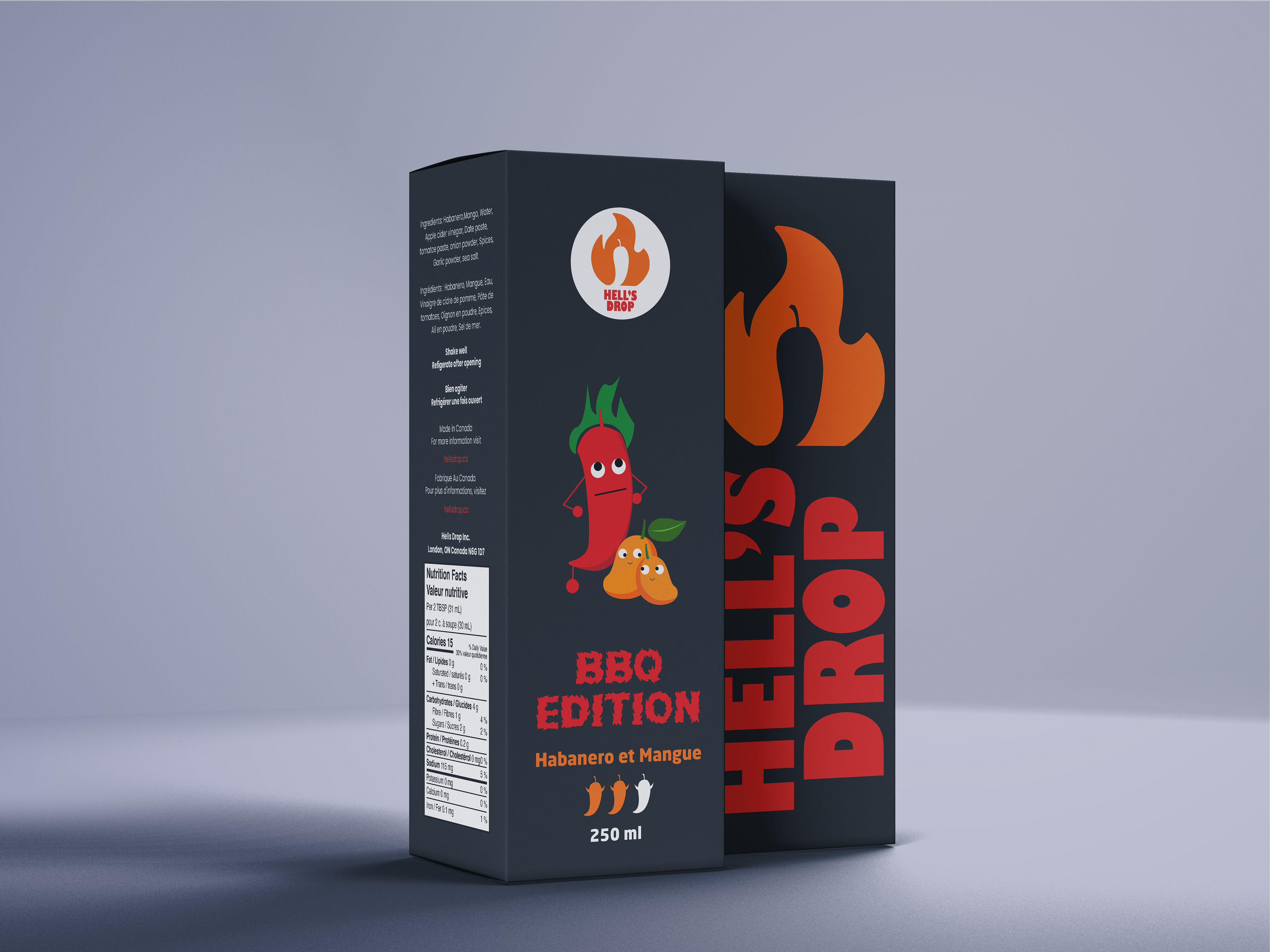
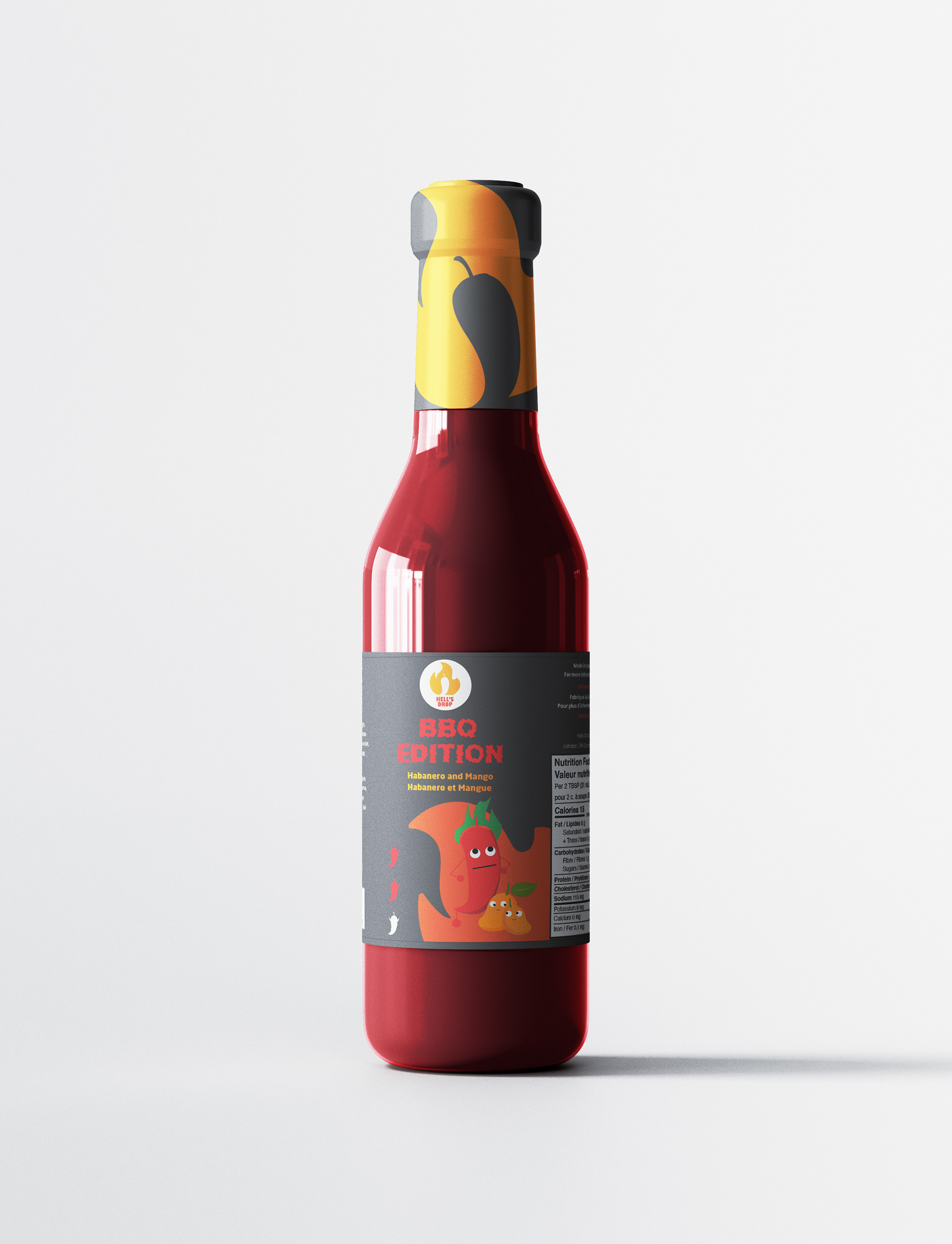
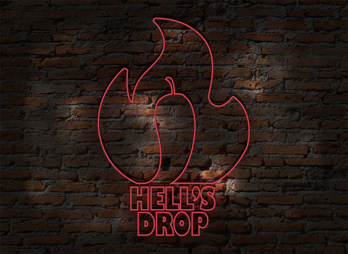
For Hell’s Drop, a playful Canadian hot sauce brand, I designed packaging that brings its bold
spirit to life. I illustrated the ingredients with fun, human-like traits, giving the bottle a cheeky,
animated vibe that stands out on the shelf.
spirit to life. I illustrated the ingredients with fun, human-like traits, giving the bottle a cheeky,
animated vibe that stands out on the shelf.
Bold typography and a fiery palette of black, orange, and red highlight the sauce’s heat and
premium quality, while bilingual labeling keeps it authentically Canadian. The result is
packaging that’s as lively and daring as the flavor inside.