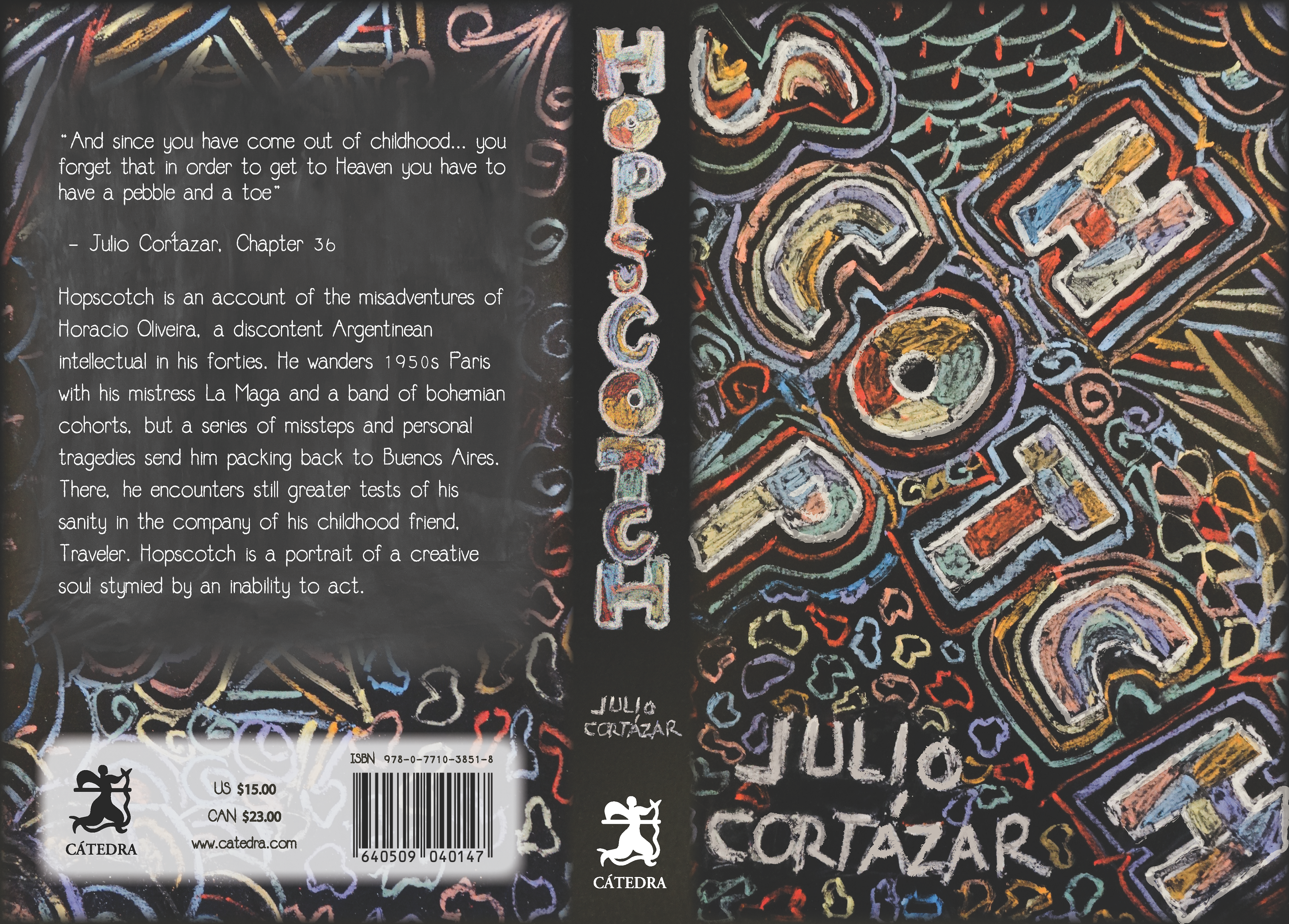
The goal of this edition was to introduce Hopscotch by Julio Cortázar, a Latin-American classic, to young Canadian readers through a fresh and approachable design. The cover, crafted by hand with chalk and refined in Adobe Illustrator, blends playful textures with nostalgic childhood colors. The typography subtly nods to the shapes of the hopscotch game, creating an engaging yet understated reference to its theme. This balance of whimsy and sophistication ensures the book feels inviting while honoring Cortázar's innovative storytelling.
