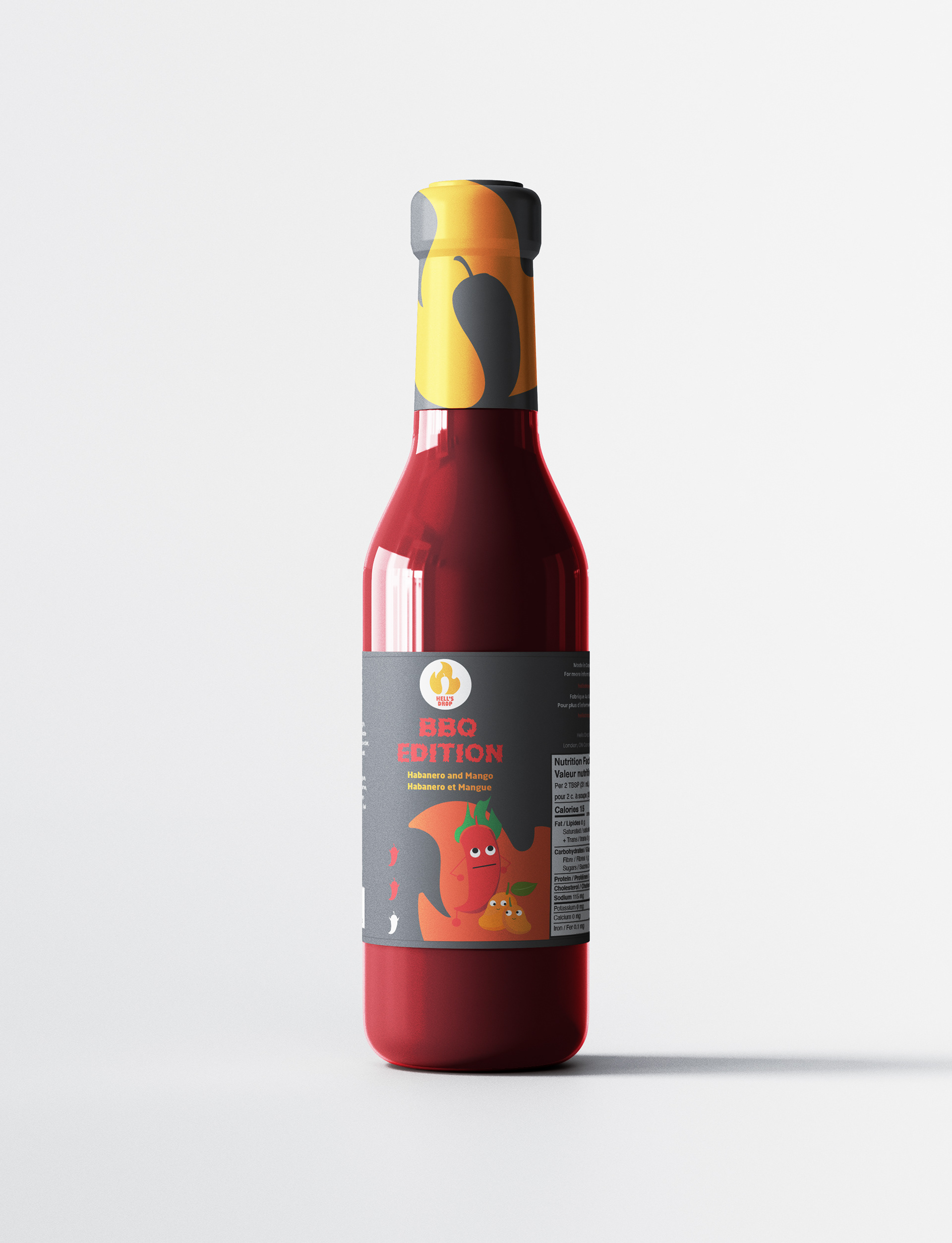
For Hell’s Drop Hot Sauce, a brand celebrated for its fun and carefree identity, I crafted a packaging design that seamlessly blends playfulness with strong visual appeal and brand recognition.
The design features lively illustrations of ingredients with human-like characteristics, adding a quirky, cartoonish charm that perfectly aligns with the brand’s vibrant personality.
Bold typography highlights the brand name prominently on one side, ensuring instant recognition, while the strategically placed logo reinforces visibility on the front.
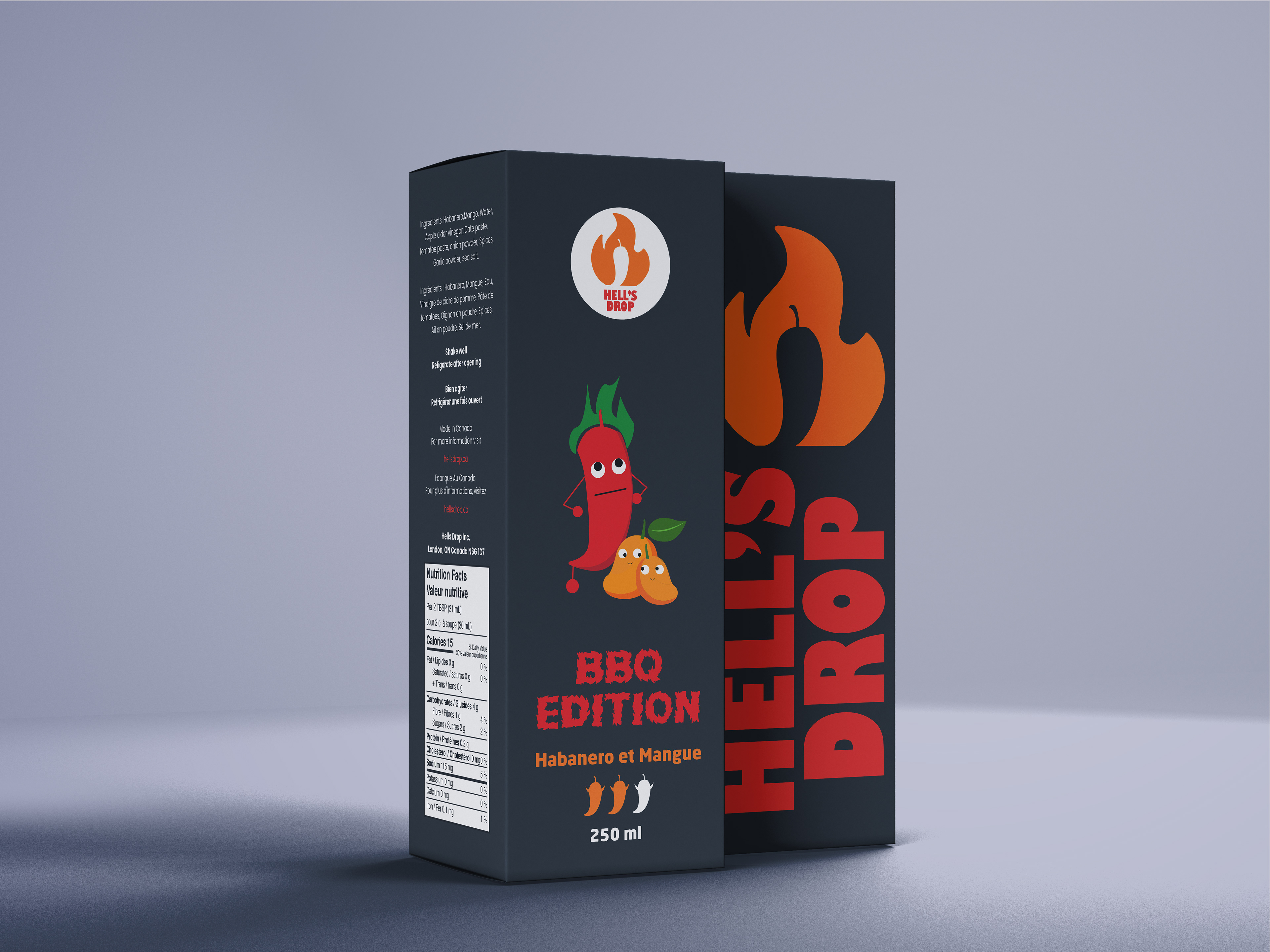
The color palette: black, orange, and red; captures the sauce’s fiery heat and premium quality, creating a visually striking and cohesive look. To reflect the brand’s Canadian roots and cater to a bilingual audience, the packaging includes nutritional facts and supplementary information in both English and French.